Leading European Energy Provider

Redesigning the Home Energy App with a Clear, User-First Vision

In an era where customers expect energy management to be as seamless as their favorite streaming services, a leading European energy provider recognized the need to modernize its digital interface. In collaboration with gridX, we set out to overhaul the provider’s Home Energy Management System (HEMS) app, ensuring it could serve as a powerful, unified hub for the modern prosumer. The project was designed to transform the app from a technical utility into a user-centric tool that builds long-term loyalty and trust.
Services
Customer Journey Optimization
New Product Discovery
Digital Products & Apps Development
Design System Development
7
8
5
6
2
7
5
0
4
4

Months, from concept to tested and validated design for the full relaunch foundation

7
8
5
6
2
7
5
0
4
6
0
6
3
9
0
8
4
2
6
5
+

Users across multiple markets validated the HEMS App redesign

The Challenge

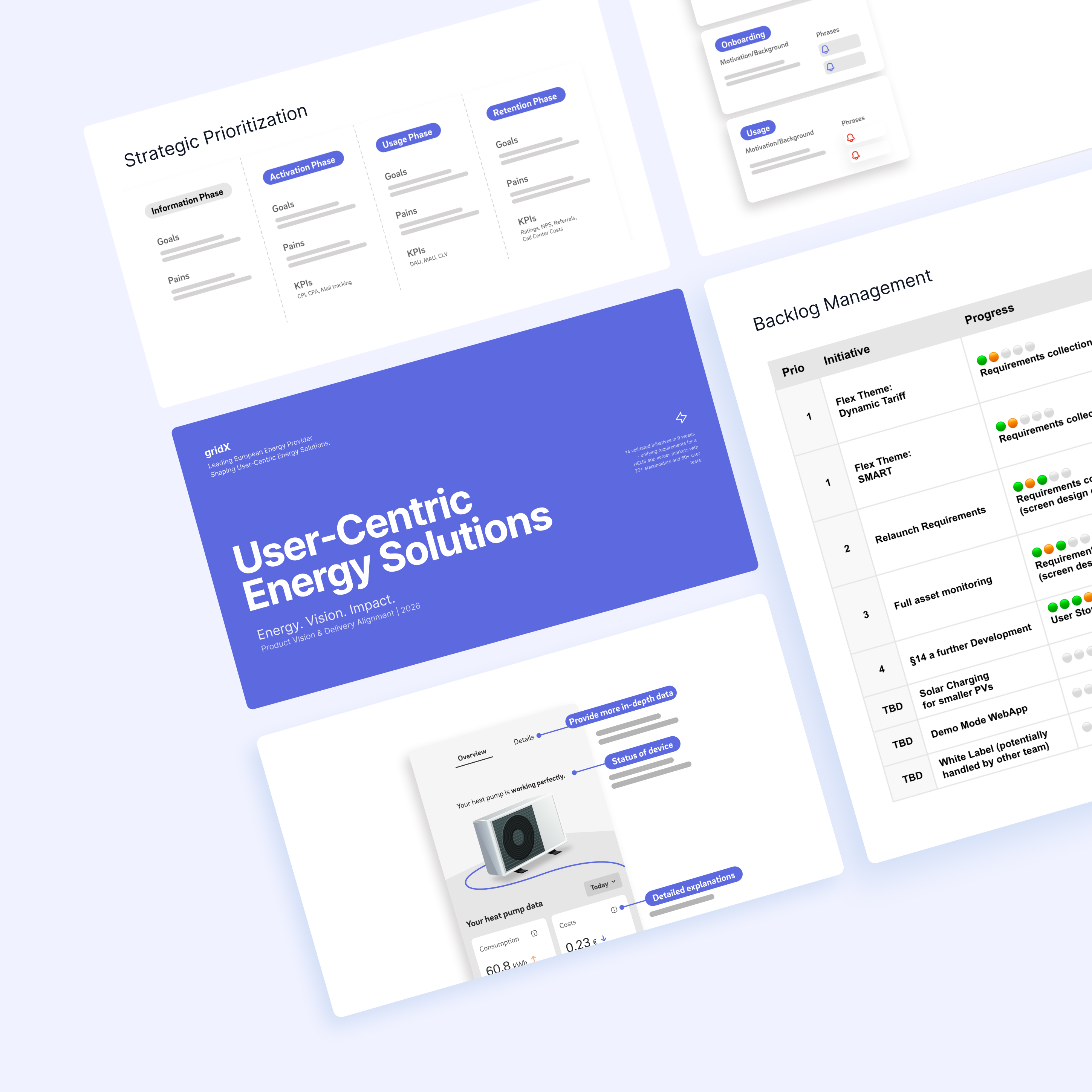
Over time, the existing HEMS app had grown into a "dense jungle" of functions and graphs. It offered users a high volume of data but very little clarity, making it difficult to navigate or engage with core energy insights. This complexity led to a significant gap between customer expectations and the provider's delivery, resulting in frustrated users and poor public app store ratings. An audit revealed a critical lack of user guidance, overloaded screens with incomprehensible data clustering, and an outdated design that failed to meet modern accessibility and branding standards.

The Result

Simplifying Complexity to Empower the Modern Energy User

DPM and gridX worked shoulder-to-shoulder with the provider’s product, brand, and engineering teams to define an experience that guides rather than overwhelms the user.

  • Intuitive Architecture: We redefined the app concept based on the customer journey, prioritizing easy access to core features and relevant data points.
  • Data Clarity & Trust: By applying the "Earned Trust" pillar of our CHOSE framework, we refined how data was surfaced, allowing users to understand their behavior and savings without needing to be energy experts.
  • Accessibility & Brand Excellence: Every screen was redesigned to be visually clean and fully optimized to meet WCAG accessibility standards, ensuring inclusivity for all users.
  • Smart Coaching: We introduced an animation and notification concept designed to coach and delight users at critical moments, turning data alerts into actionable energy-saving opportunities.
The Outcome
  • Rapid Delivery: A fully validated and implementation-ready product concept was delivered in just four months.
  • Organizational Alignment: Established better alignment between the provider’s brand, UX, and technical development teams.
  • Market Readiness: Created a smarter, friendlier app experience that significantly increased retention potential and readiness for mass-market growth.
  • Retention Advantage: The new design offers a customer-focused interface that encourages long-term engagement and user loyalty.
Our Approach
  • Iterative Design: We developed and iterated UX/UI designs with a strict focus on simplicity and usability, ensuring every pixel served a user need.
  • Cross-Functional Collaboration: We acted as the bridge between strategy and execution, collaborating with product and engineering to ensure the solution was both practical and buildable.
  • User-Led Validation: We integrated continuous user feedback throughout the process, testing every screen against real-world use cases to ensure relevance.
  • Behavioral Activation: We created a notification concept that addresses actual user needs while strategically supporting the provider’s activation and retention goals.
  • Comprehensive Documentation: We delivered a fully validated product concept that covered all key use cases, providing a clear roadmap for the technical implementation team.

Ready to make an impact?

Turning complex ideas into clear, user-centered product experiences.