#gender #gender sensitive des #inclusion

26. Juli 2022 |
- min Lesezeit
I’ll bet you know someone who’s color blind. Maybe that someone is you?
Data from the UK shows that around 1/200 European women, and 1/12 men are red-green color blind. That’s 8.3% of men and 0.5% of women who don’t know that Coca-Cola is red.
Not exactly essential knowledge.
But let’s apply that to your business. Let’s imagine you sell furniture online. You think your customer sees this on your landing page:

Nice looking yellow couch, isn’t it?
Here’s the same image run through a color blindness simulator:

Different right?
If you had the most common form of blue color blindness (Tritanopia), this is what you’d see. How many people visit your website every month? Do they see what you want them to see? Do they act predictably? Do they feel included?
These are the kinds of questions that underpin inclusive design and sensory differences are just one aspect.
The big question here is, do they feel welcome?
When a visitor feels welcome they want to stick around. Feeling welcome is an emotional experience based upon relevance and trust. You have what your prospect wants and they like you.
When your website users trust you, they’re more likely to buy from you.
A warm welcome is good for business.
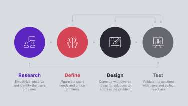
Inclusive design is part of user-centered design (UCD). UCD is about creating practical and meaningful connections between humans and technology. This means finding out what users want and learning how to serve them better.
The goal is to find solutions that prioritize the needs of the user. Feedback is then collected and re-integrated into the development process to refine the design.
“Did we get it right for you? If not, why not? What about now?”
In design, we call this “how” the UX, or User Experience. UX is about the feelings and thoughts users have when interacting with your brand offering. It makes UX one of the most complex, and crucially relevant tasks in the product development cycle.

When you commit to building your products and services around the user, you put them at the center of what you do. They are literally included.
A user-centered design is both efficient and enabling. In a way, it’s invisible. When your customers forget that they’re interacting with a design, that’s when it truly becomes relevant and useful.
Brand seeking a relationship of trust with their audiences, it’s essential to elevate and practice inclusive design. By pursuing standards of accessibility and diversity, brands can help build empathy with their users, ensuring their products and services meet the needs of all audiences.
How users think and feel about your brand are two of the most crucial and complex elements in product development. Only a strong brand that your target group identifies with wins their hearts and not just their minds.
When you commit to putting your users at the center of what you do, they are literally included. A user-centered design approach is both efficient and enabling. In a way, it’s invisible. When your customers forget that they’re interacting with a design, that’s when it truly becomes relevant and useful.
Accessible design is concerned with how things work. It’s a process that pays special attention to the needs of people with impairments or disabilities.
Why does it matter?

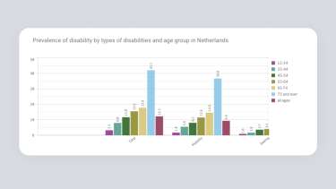
This data from the Netherlands shows that around 15% of people under 75 have some kind of accessibility need. This figure jumps to around 40% for those people aged 75 and over.
This is backed up by the World Health Organization who put the global figure at 15% and rising.
That’s a lot of people!
In light of this data, if we don’t embrace accessible design then we’re choosing to make design inaccessible. This would deliberately exclude users and that makes no sense ethically, financially or emotionally.
The goal is to create an enabling experience that dissolves the physical, cognitive, or sensory barriers for the user. This allows them to interact on equal terms and leads us to a kinder and more connected world.
We can make a design more accessible by thinking about:
If you want to learn more about accessible design, the US government has some excellent guidelines for designers.

Imagine, you’re a blue “woman” and you want to buy some running shoes. You go to a website and see only green “men” in trainers. How do you feel? Are you going to stick around?
Maybe not.
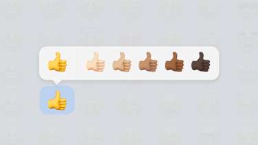
Diversity in design is about how a design feels to traditionally marginalized or underrepresented groups.
Users need to feel welcome. When we see people like ourselves in a design, we feel that it’s relevant. A relevant design is the foundation for engagement and interaction.
We can improve diversity in design through:

Over the last few years, the concepts of inclusivity, accessibility, and diversity have moved into mainstream culture. There’s a strong, communal desire for us to live in a more inclusive world.
Inclusion is now an expectation not a dream. By making our designs more accessible and diverse, we’re taking positive action. Through this kind of social responsibility, we’re doing our bit to make the world a better place for everybody.
A more inclusive design process will improve market viability by opening up the product to a wider user base. As designers, developers, and business owners, we want all people to buy, use and enjoy our products.
We want demand for these products to be sustainable, and this requires adaptability.
Inclusive design supports this by allowing businesses to adapt and to include new consumers as they enter the market. From a growth perspective, accessibility, diversity, and inclusion are important ways to maintain contact with an expanding customer base.
Inclusive design is now intrinsic to product resilience and commercial success. As the old saying goes:
“Show me and I might not see, tell me and I might not hear, involve me and I will understand.”

Designers love to overcome challenges. That’s what we do, we solve problems and find solutions.
In inclusive design some of the challenges include:

At DPM, inclusive design is a key part of our methodology. Through research, interviews, and real-world testing, we design directly around the user.
In one of our current projects, we are developing a website for a senior target group and adapting the user experience directly to their needs. To do this, we are implementing the following measures:
Yes, the design had to be accessible and user-friendly, but that didn’t mean sacrificing functionality or aesthetics.
Inclusive design is underpinned by empathy for others. It’s driven by a desire to understand the human experience from a range of diverse perspectives.
As we begin to see and feel the world differently, we start to appreciate different points of view. We become more open minded.
When we put inclusion at the heart of our designs, we see that design can be an engine for positive change. Every project is a chance to build meaningful connections between people and technology.
Effective design requires empathy, curiosity and attention: how do users feel? What do they need, and how can we serve them better?
The answers are out there. We just need to ask…
Inclusive design starts with a kind and direct approach to communication. Click here to read how Kim Scott uses “radical candor” to get things done.
Find out about inclusive design at the Inclusive Design Research Center.

