#hackathon #product-discovery #prototyping

09. Apr 2019 |
- min Lesezeit
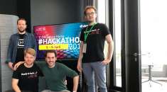
Everyone knows them, the people who hurry directly to the gate at the airport after the security check, only to kill the time until departure there. “How to animate them to stop by to see the dealers at the airport” was the question to which trend-setting digital answers were sought. A challenge that was very well received by us because the psychology behind airports, train stations, shopping centres and even city centres has always fascinated many of us.
Within our first ideation session, it quickly became clear to us that this challenge is not as easy as it sounds at first glance. Since we naturally wanted to be user-driven, the first difficulty lay in identifying user problems. Of course, some passengers feel insecure, nervous, or have no interest in the shops at all, but how do we get these passengers to buy in the shops?
It’s actually quite simple: One situation that everyone knows is that you still have to get rid of the remaining money in the foreign currency. So you stray through the airport and compare prices. Some products are simply not interesting, others are too expensive or too cheap. Ultimately, you buy something, no matter what – it’s better than taking the foreign currency home with you. Why not recommend suitable products to these people?
After a few small iterations and internal pitch sessions, our new product idea was born. Tremendously proud we started the idea pitches on the first Hackathon day and then gradually refined the concept and design.
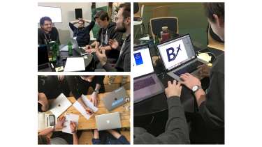
With BudJET you will find the best products for your leftover money. The channel for our tool is the confirmation page of the Wi-Fi registration, which about 90% of the travelers see anyway. From there you enter the amount you want to get rid of into our web-app. Due to your travel destination, the distance of the shop to your gate and your budget, we recommend suitable products. You can view and compare them online. We will show you in a simple calculation how much remaining money you have or what you have to add. Once you’ve found some exciting products, you’ll simply be shown the best route through the airport - in AR, of course, to make shopping an experience.
For our prototype we worked with real products (~15.000), which we crawled from an aiport website. In the first step we calculated the distance from brandshops to the gate and considered the adjusted budget to provide personalized suggestions. Of course we want to extend the recommendation engine by taking more information like the country of destination into account, therefore it would be reasonable to setup a deeplearning model for large amounts of data. Besides some basic webapp technologies we used A-Frame to show the seamless transition from map navigation to an AR enabled route.
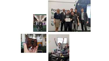
In our final pitch we presented the user problem, the prototype and the business case to the jury on the big stage. The jury’s evaluation was based on four criteria: The user-friendliness, the level of innovation, the technical implementation of the prototype and the business case behind it. Although we are convinced and proud of our product, the many other good pitches and the broad field of participants made it very exciting once again. But the jury was just as convinced of our product idea and the preparation of the concept as we are. So we were able to return to Munich as winners of the hackathon.
